When it comes to designing your commercial signage, the font you choose isn’t just a small detail; it’s a direct reflection of your brand. From large signs that tell customers where you’re located to small wayfinding markers on the inside of your store, choosing the right font for your business signage can have a powerful impact on how customers perceive your business. How can you make the right choice for your business?
Think About Readability
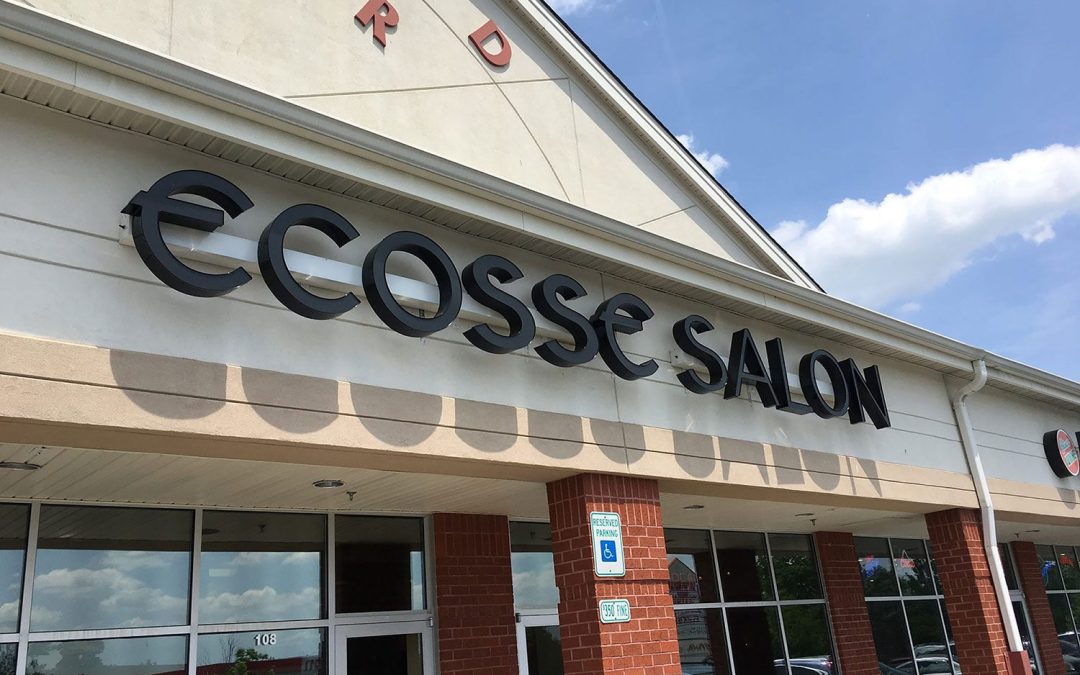
One of the most important considerations when choosing the right font for your business signage is readability. Your signs need to be easy to read from a distance and in a variety of lighting conditions, especially if they are going to be placed outside. Decorative or overly stylized fonts might look appealing on your computer screen, but if they’re hard to read on a sign across a parking lot, they aren’t helping you get business. Make sure that you choose clean, legible fonts like sans-serif styles for maximum visibility.
Don’t Be Afraid to Show Your Personality
Just like pictures and colors, fonts can evoke emotion and convey a certain tone. A playful font might be perfect for a children’s toy store, while a bold, modern typeface might be more appropriate for a tech company. When choosing the right font for your business signage, consider how well the style of the font reflects your industry, your products or services, and your overall brand identity. If you already use a specific font in your logo or on your website, it’s a good idea to stay consistent. Coordinating your font across your brand can reinforce brand recognition for customers.
Consider Size and Scale
The look of the font you choose is not the only thing that matters! Size and scale are also crucial. A thin or narrow font might work well in print or online, but on a large sign, it can lose its impact. In the same vein, script or cursive fonts can become illegible when they are scaled down too small. Choosing the right font for your business signage involves understanding how it will scale across different sign sizes, whether you’re working with a large outdoor banner or a small indoor directional sign.
Be Aware of Contrast and Color
Even the best font can become ineffective without the right contrast. A light font on a light background or a dark font on a dark background can render your sign unreadable. High-contrast combinations like black on white or white on dark blue tend to be the most legible. Choosing the right font for your business signage also means thinking about how the font color will interact with the rest of your brand’s color palette and your chosen signage materials.
Partner with the Professionals at East West Sign Group
We are experts in designing, installing, and maintaining effective signage of all kinds. East West Sign Group knows all about sign design, and we have worked with countless businesses to create great signage that gets good results. If you’re looking to create business signage that is beautiful and legible, we’re here to offer guidance throughout every step of our process. We’re dedicated to providing a high-quality product that is long-lasting and durable. What are you waiting for? Work with an expert sign company and contact us today!